Dark Mode: How Your Interface Manipulates the Perception of Luxury and Price?
Dark Mode is undoubtedly one of the leading UX trends of recent years. Increasingly, internet users and mobile app users perceive this functionality as standard and very often almost automatically enable it when the opportunity arises. In e-commerce, Dark Mode has the potential to be a tool much more powerful than you think.
Reading further, you will learn about the psychological impact of Dark Mode on the user: Does the dark interface increase the perception of luxury and the price of your product, or, on the contrary, does it lower it? We will provide you with practical guidelines in the field of UX, UI, and accessibility, and also show how e-commerce leaders are strategically using dark themes to build brand credibility and maximize conversion.
Listen to the audio version of this article.
Dark Mode: Not Just a Trend, But an Architectural Challenge
Dark Mode has evolved from a niche feature for developers to a global UX standard, mandated by tech giants such as Apple, Google, and Microsoft. Dark Mode has become not only an aesthetic choice for the user or a relief for the eyes at night. It has become a crucial architectural challenge and a strategic tool in the hands of e-commerce managers who strive to consciously shape brand perception and maximize conversion. Market giants have raised the bar, and it is worth preparing to clear it.
But why can't e-commerce limit itself to designing a single theme anymore? Because users expect consistency. If their operating system, email, and messenger are working in Dark Mode, switching to a glaringly white online store page is an experience that breaks immersion and causes discomfort.
So let’s consider the business reasons why Dark Mode is a necessity today:
Loyalty and Ergonomics: Aligning the experience with the user's system preferences increases the perception of attention to detail and ergonomics, which translates into loyalty.
Extended Session Time: Reducing eye strain, especially during evening shopping sessions, allows users to spend more time on the platform.
Standing Out from the Competition: Although more and more platforms have implemented Dark Mode, it still remains a distinguishing element, signaling modernity, innovation, and embracing technological development.
Energy Efficiency and Performance: Dark Mode saves energy on devices with OLED/AMOLED screens (which turn off pixels when displaying black). Some experts suggest that a well-optimized theme can slightly support LCP (Largest Contentful Paint) indicators because the dark background is sometimes loaded faster.
Price Perception and Luxury (UX)
Dark Mode is more than just color inversion. It is a change of scene on which your products are presented and a modern approach to user interface design. The manipulation of light and shadow has a deep psychological impact that can be strategically exploited.
Impact on Brand Perception
The strategic question: Does Dark Mode lower/raise the price perception of the product?
The answer is not black and white, but in most cases, dark themes raise the perception of value and luxury.
Important: It is worth remembering, however, that brands whose communication is based on accessibility, joy, and "lightness" (e.g., children's products, cheap accessory stores) may lose authenticity in an overly dark environment. A bright background better conveys the open, friendly, and "easy to understand" nature of the offer.
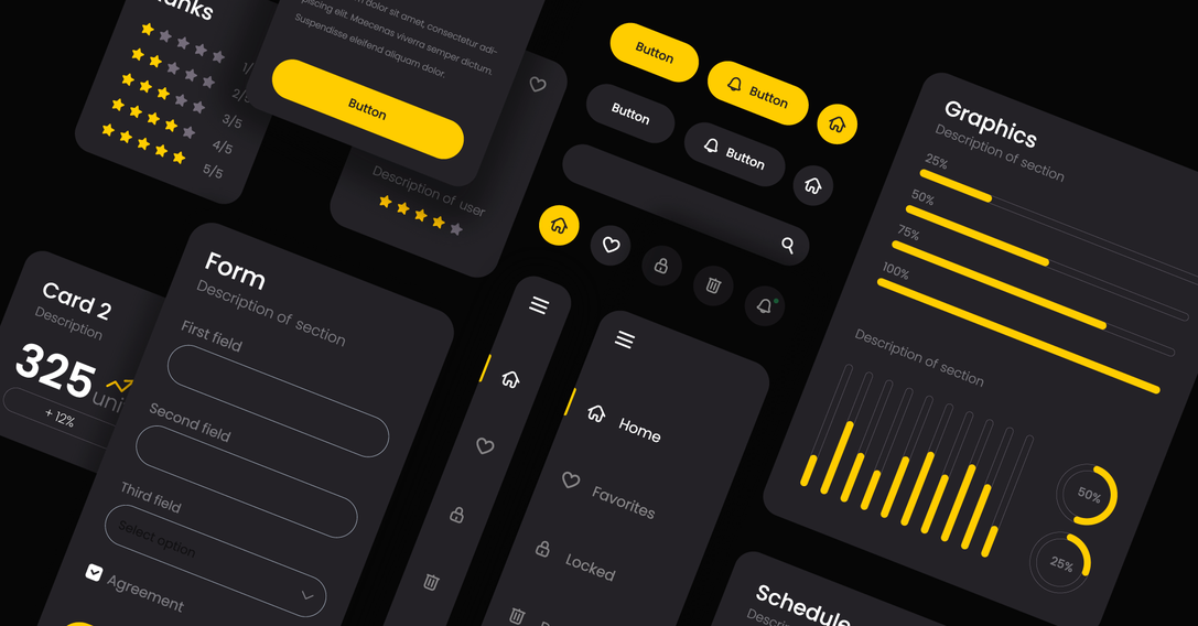
Minimalism and Exclusivity: Dark backgrounds, especially deep grays or matte blacks, are associated with elegance, mystery, and exclusivity. It minimizes distractions, directing the user's entire attention to the exposed product (e.g., a watch, jewelry, an expensive tech gadget).
Contrast that Sells: Bright products on a dark background achieve unprecedented contrast and depth. The dark background acts like a black velvet pad, making the item gain significance and appear more valuable.
Credibility: Brands that invest in two carefully designed themes seem more credible and customer-oriented.

Accent Color and Conversion
In Dark Mode, the role of the accent color (the one you use for buttons, links, and CTAs) is critical.
High Contrast: Colors with high luminance (brightness) that contrast with the surroundings work best on a dark background. These are often neon shades, bright blues, greens, energetic red, or intense yellow. This guarantees immediate eye attraction to the key interactive element.
CTA Psychology: BUY NOW or ADD TO CART buttons must "glow." Dark Mode thus offers a chance to use colors that would be too aggressive in Light Mode.
| Branding Element | Light Mode | Dark Mode | Design purpose |
|---|---|---|---|
| Background | White (#FFFFFF) | Dark Grey/Graphite (#121212 or #1E1E1E) | Reducing eye strain, avoiding the "black trap". |
| Main text | Black (#000000 / Dark grey) | Light Grey (#E0E0E0 lub #AAAAAA) | Maintaining readability, preventing halation. |
| CTA Button | Intense light blue (#007AFF) | Neon Blue/Lime (#00A7FF or #A0FF00) | Maximum contrast and immediate conversion indication. |
It is worth remembering that changing the theme should not involve changing the accent colors throughout the branding, but only adjusting their brightness to the new background.
UX and Readability: The Traps of Dark Mode
Dark Mode, though elegant, is more difficult to implement than the light theme. Design errors at this stage can lead to user frustration, a drop in readability, and consequently, a loss of conversion. When designing it, one must be prepared for the fact that some interface elements may require correction.
Managing Contrast and White
The strategic question: When is the light theme essential?
The light theme remains essential in situations where text readability is an absolute priority, and the user spends a long time on it. Examples include:
Long product descriptions (especially technical ones requiring focus).
Terms and conditions sections, privacy policy.
Blogs and extensive guides ( within e-commerce).
Invoices and order confirmations (often look better and are more readable in neutral white).
What is the "Black Trap"?
The "Black Trap" is a common mistake made by UX and UI designers where they use pure black (#000000) as the background color and pure white (#FFFFFF) for the text. Although this combination provides maximum contrast, it causes significant eye strain.
Pure black generates too much contrast with bright text, leading to a phenomenon called halation—letters appear blurry and surrounded by a subtle glow.
You should use dark grays instead of black (e.g., #121212, #1E1E1E, or #282828). This ensures the contrast is sufficient for reading yet gentler on the eyes.
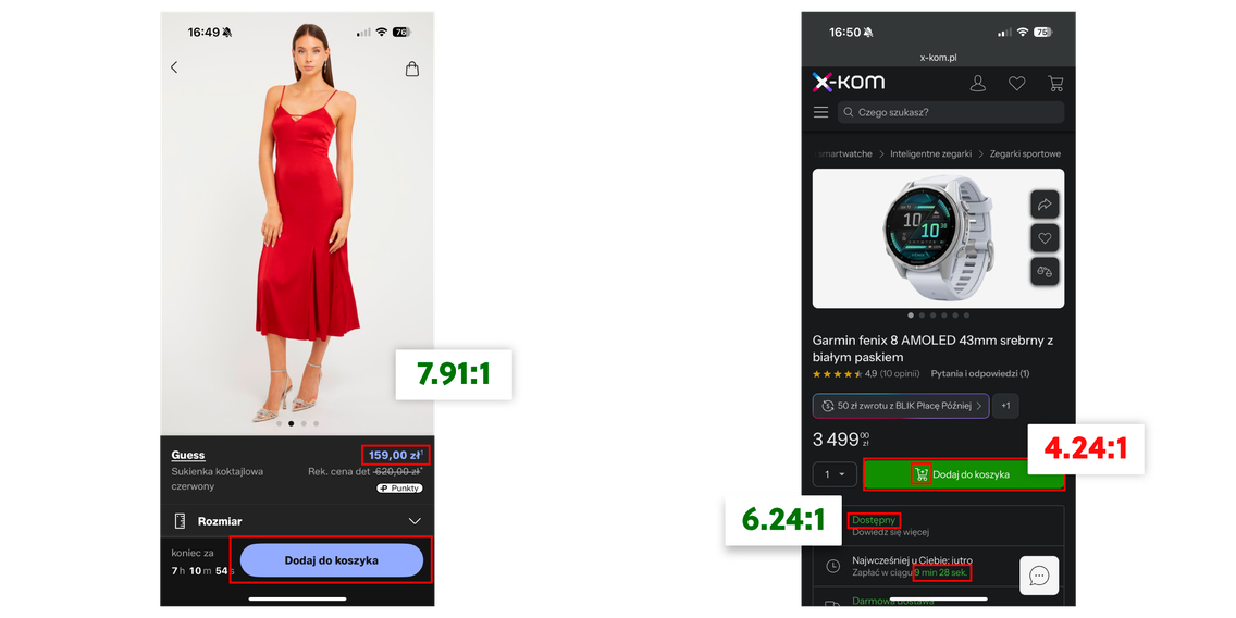
Dark Mode and Purchase Finalization (Checkout)
As we know, the purchase finalization phase (cart, checkout) contains the most critical conversion pages. Research suggests that for maximum simplicity and trust, these pages should often be maintained in a light, neutral style. At this stage, the standard solution of a black text on a white background will maximize the user experience.
The Dark Theme can be perceived as too distracting or unnecessarily complicated at the moment when the user wants to make a payment quickly and securely.
Strategy: It is advisable to allow the user to use Dark Mode while browsing products, but it would be prudent to automatically switch the cart and payment page to Light Mode or use a neutral, light background inside the central checkout container.
Managing Visual Elements
Switching themes requires a thorough revision of all visual assets that were initially designed with a white background in mind.
Photos and Illustrations
Product Photos with a white background, placed directly on a dark background, often look unnatural and sharp.
Solution: Apply a slight edge highlight (stroke) or add a minimal, dark shadow around photos in Dark Mode. This ensures a smooth transition between the image and the background. For vector illustrations (PNG, SVG), you should apply filters or swap the files for versions with the bright background removed.
Icons and Strokes
Icons that were black (#000000) with a thin outline in Light Mode will simply disappear in Dark Mode.
Solution: You should increase the brightness of the icons, using light gray or white, and adjust the thickness of their stroke. Shadows that add depth in Light Mode should be replaced with highlights in Dark Mode to maintain the impression of layering.
Dark Mode: Accessibility and Discovery
Integrating Dark Mode into your e-commerce strategy also requires considering accessibility and its impact on how users find products. It's important to ensure customers feel comfortable on the website or app.
Dark Mode and Accessibility
For many users (e.g., people with visual impairments, photophobia, or dyslexia), light reduction is important. Dark Mode enhances comfort and improves readability for people sensitive to light.
WCAG 2.0/2.1 Guidelines: For dark themes, it is critical to achieve a minimum contrast ratio of 4.5:1 (for normal text) and 3:1 (for large text/graphical elements) between the background and the foreground text. A properly designed Dark Mode (using grays, not black) easily meets these criteria if the text brightness is chosen correctly.
Dark Mode and Discovery
How it can help: Displaying images on a uniform dark background enhances focus on the product itself. In e-commerce, where the photo is the most important conversion element, Dark Mode can be a powerful tool for attracting attention.
How it can harm: If a poorly designed Dark Mode masks or weakens the visibility of filters, categories, and small navigational elements, it can make it difficult for the user to discover products. Ensure that interactive elements are always surrounded by an appropriate margin and a contrasting color, so that content in Dark Mode is just as accessible as in Light Mode.
Scientific Evidence: Impact on Dry Eye Syndrome and Eye Strain
Scientific studies from the International Journal of Environmental Research and Public Health directly compare Light Mode and Dark Mode. They provide valuable information for UX designers, especially in the context of prolonged device use, which is typical for e-commerce (long shopping sessions).
Key Findings (Based on Studies on Tablet Users):
General Fatigue: Although prolonged tablet use leads to general eye strain regardless of the theme, Dark Mode shows statistically significant, more favorable differences compared to Light Mode.
Dry Eye Syndrome: It was found that Dark Mode has a significant effect on reducing the symptoms of dry eye syndrome compared to Light Mode. This is a key indicator of comfort and visual health.
Critical Flicker Frequency (CFF): Significant differences were observed in the range of CFF, which is a measure of subjective eye strain. Although the practical significance may depend on the intensity of use, this proves that Dark Mode has a measurable impact on physiological parameters related to discomfort.
The conclusion is that although the aesthetics of Dark Mode are a powerful psychological tool, its implementation is also supported by measurable health and ergonomic benefits. In e-commerce, where extending the session is the goal, Dark Mode becomes a tool for reducing physiological barriers.
Dark Mode in Practice: Examples from the Polish Market (E-commerce and FinTech)
Finally, it is worth looking at examples in the market where you can see how Dark Mode is strategically used, especially in mobile applications, where ergonomics and extending session time are key.
Marketplaces and Classified Apps (e.g., OLX, Vinted, also X-Kom)
The main goal is to extend the session time. Users spend a lot of time browsing listings here, often in the evenings. The dark theme reduces eye strain while prominently displaying product photos on a neutral, dark background.

Luxury E-commerce and Premium Fashion
In this segment, Dark Mode is often a strategic aesthetic choice intended to raise the perception of price and luxury. Stores with premium products, such as designer fashion or exclusive jewelry (e.g., La Mania, Bizuu) or luxury car brands (BMW), use matte, deep gray backgrounds to highlight the product. Although they don't always offer a switch (often relying on a dark theme by default), their design perfectly fits the psychology of Dark Mode, building associations with elegance and the high-end market.\

Financial Services (Mobile Banking)
Although not pure e-commerce, many banking applications in Poland have implemented Dark Mode as a UX standard, building trust through the new functionality. An example is the GOmobile application (BNP Paribas), which offers a dark theme to improve comfort during transactions (often carried out at night).

Conclusion: Strategic Design Decisions
Dark Mode is much more than just an inverted color scheme. It is a conscious, strategic UX decision that directly impacts the business: from the perception of price and luxury to the time a user spends on our site.
When implementing Dark Mode, e-commerce managers and UI/UX designers must move away from simple inversion and focus on nuances: using dark grays instead of black (to avoid halation), strategically utilizing neon accent colors for conversion, and ensuring full accessibility (WCAG 4.5:1 compliance).
The most important lesson: Investing in two carefully designed themes is an investment in customer loyalty and brand credibility. In a world where competition is just one click away, Dark Mode becomes an essential tool that allows you to control perception and retain user attention.
However, Dark Mode is just the tip of the iceberg when it comes to UX optimization. If you run an e-commerce store with premium products and want to ensure that every element of the design, from the background, through typography, to the checkout process, works to enhance your perception of luxury and price, it's time for a deep audit.
Contact our team of UX/UI experts. We will help you implement strategic solutions that will turn visitors into loyal, premium customers.
Let's talk about potential areas of collaboration!
Hi!
during the first consultation we'll analyze your goals through the lens of ROI and operational risk. Whether we're building an Enterprise system, an application, or an AI automation — together we'll plan an architecture that eliminates your technical debt and unlocks scalability.


You can find more articles on this topic on our blog
UX vs UI - Get to Know UX Design and UI Design Better
Every website designer relies on UX and UI. Read this post and check out the similarities and differences between UX design and UI design.
6 min
Read more

Website UI update
Updating website design and functionality. How often to design new features and appearance.
12 min
Read more

What is UI (User Interface)?
UI user interface - definition, how to design, what changes good design in user interaction with the site.
5 min
Read more