
A clickable prototype instead of a 50-page spec in e-commerce
Why a clickable backoffice mockup speeds up board decisions in e-commerce projects and cuts implementation risk. A practical guide.


A clickable prototype speeds up board decisions because it shows a working interface instead of a description of how something should work. The board signs off on what it can see and touch, not on 50 pages of a document nobody reads all the way through.
That sounds like a small change of format. In practice it changes the whole dynamic of a project. Instead of weeks of emails arguing over how to read a clause, you get a meeting where someone clicks through a mockup and says "something's missing here." The difference shows up fastest in the backoffice, the less glamorous part of a store that customers never see but that decides whether your order-handling team has an easy job or a nightmare.
In this article we'll show why a spec as the only decision-making artifact fails, how a clickable prototype differs from it, and how to slot it into a phased implementation project. We write this from the perspective of a team that regularly works in a discovery-plus-prototype model before a single line of production code gets written.
Why 50 pages of spec fail
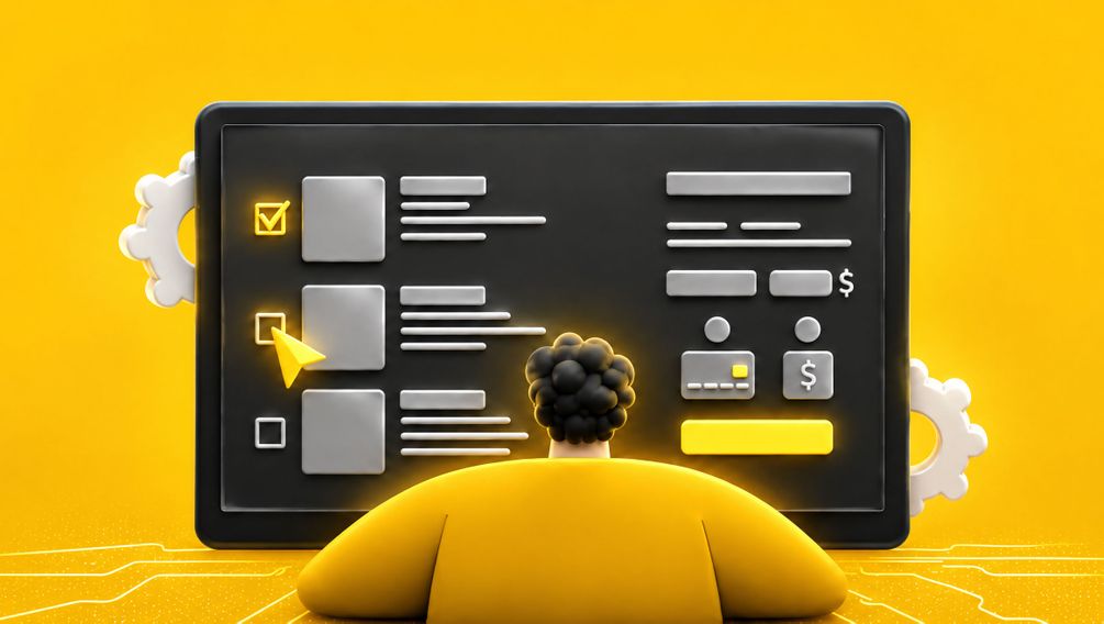
A spec has one fundamental flaw: it uses words to describe something that is inherently visual and interactive. The sentence "the panel should allow filtering orders by status" can be read ten different ways. One person pictures a dropdown, another pictures tabs, and the developer builds it their own way regardless.
The problem isn't the author's carelessness. It's the medium. Text forces every reader to build their own mockup in their head, and those mockups are never identical. The illusion of agreement holds until someone sees the finished screen and says, "but I thought it would be different."
Three typical spec document traps
The illusion of consensus. Everyone nods in the meeting because each person reads the clause their own way. The conflict surfaces only at acceptance of the finished feature, when a change costs ten times more.
Unreadable for the decision-maker. A board member won't read 50 pages describing backoffice processes. They'll either approve it blind or bounce it back asking for a "summary," which delays the project by more weeks.
Deadness. A spec is static. You can't click through it, you can't feel how many clicks stand between an operator and processing a return. And that click count is exactly what drives operating costs.
Well-known research on IT projects has shown for years that the most common causes of implementation trouble are unclear requirements and poor communication between the business and the technical team, not the technology itself. A document everyone interprets differently is fuel for precisely that kind of trouble.
What a backoffice clickable prototype Is
A clickable prototype is an interface mockup you can navigate like a real application, even though there's no working logic or database underneath. You click "Orders," a list opens. You click a specific order, you see its details. Everything looks and reacts like a product, except the data is sample data and the actions are simulated.
In e-commerce, the most interesting prototype is the backoffice, the back-of-house. This is where the team processes orders, manages returns, adjusts stock levels, and issues corrections. A storefront can be flashy, but the backoffice generates daily operating costs, and it's the one most often described worst in the spec.
What a prototype shows that a document won't
The key difference is psychological. A person looking at a screen judges it instantly and concretely. A person reading a description defers the judgment, because first they have to imagine the screen. A prototype removes that imagining step and moves the conversation to concrete terms.
| Aspect | Text spec | Clickable prototype |
|---|---|---|
| Clicks to complete a task | You have to count in your head | Visible right away, measurable |
| Screen-to-screen transition logic | Described in words, open to reading | Clickable, unambiguous |
| Decision-maker reaction | "I need to read this" | "I get it, I'd change this here" |
| Catching a missing step | Usually only at acceptance | During the first demo |
| Cost of change | Rises with every phase | Lowest, it's just a mockup |
AI rapid prototyping: why it's faster today
A few years ago, building a clickable backoffice mockup required a designer spending days in an interface design tool. Today, part of that work can be cut short with AI tools that generate first versions of screens and flows from a process description. This doesn't replace the designer, but it gives them a starting point instead of a blank page.
In practice this means discovery and the prototype can wrap up in days, not weeks. The team talks with the client about the process, generates first versions of screens, corrects them live, and comes back with a clickable version for the next meeting. That feedback loop is what actually speeds up board decisions.
What AI really speeds up, and what it doesn't
Speeds up: generating first versions of screens, layout variants, sample data, in-interface copy.
Speeds up: iteration, meaning creating the next mockup version after meeting notes.
Doesn't replace: deciding which backoffice processes are critical and which can wait. That takes a conversation with the business.
Doesn't replace: knowledge of how data flows between systems. A prototype shows the interface, not the integration architecture.
It's worth drawing a clear line between two things. A prototype verifies the interface and process logic from the user's point of view. It doesn't verify performance, ERP integration, or load during sales peaks. Those get settled at a different phase, which we'll cover shortly.
Phasing a rollout with the prototype in the middle
A clickable prototype makes sense when it's slotted into a sensible order of phases. We recommend an arrangement where the decisions most expensive to reverse get made earliest, when a change costs the least.
Recommended order of phases
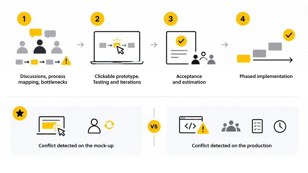
Discovery. Conversations with the business and operations. We map backoffice processes, catch the bottlenecks of the current back-of-house, and settle what's critical.
Clickable prototype. We build a mockup of the key paths: order handling, return, stock correction. The board and operations click through, comment, and we iterate.
Sign-off and estimation. Only on an approved prototype do we produce a solid estimate. The scope is unambiguous by then, because everyone saw the same thing.
Phased implementation. We build from the most critical path. The first working feature reaches operations fast, the rest gets built out iteratively.
This arrangement has one benefit that's hard to overstate: it moves the moment scope conflicts surface to the very start. A conflict caught on a mockup costs one designer iteration. The same conflict caught in production costs redesigning working code, regression tests, and a delayed launch.
Scope split: what's required and what's worth considering
When planning a backoffice prototype, it helps to split features into two groups.
Required (must have) in the prototype:
The main order-handling path, from arrival to shipment.
Return and correction handling, because this is where the biggest gaps usually hide.
Viewing and editing stock levels, if the backoffice owns that.
Roles and permissions at the view level, because they determine screen structure.
Optional (nice to have) in the prototype:
Advanced reports and analytics dashboards, which can be added later.
Rare exception paths, handled manually for the first few months.
Process automations, best designed only after the main flows stabilize.
Splitting these groups before you build the mockup saves time. A prototype of the full system with every report is again a weeks-long project. A prototype of the critical paths is a matter of days, and that's what unblocks the board's decision.
This approach has one advantage that cannot be overstated: it brings the point at which scope conflicts are revealed right to the very beginning. A conflict detected at the mock-up stage costs the designer a single iteration. The same conflict detected in production costs the redesign of working code, regression testing and a delay in launch.
Scope breakdown: what is required and what is worth considering
When planning a back-office prototype, it helps to divide functions into two groups.
Required (must-haves) in the prototype:
The main order processing workflow, from receipt to dispatch.
Handling of returns and corrections, as this is where ambiguities most often lie.
Viewing and editing stock levels, if the back-office is responsible for this.
Roles and permissions at the view level, as these determine the structure of the screens.
Optional (nice to have) in the prototype:
Advanced reports and analytical dashboards, which can be added later.
Rare exception flows, handled manually for the first few months.
Process automations, which are best designed only once the main workflows have stabilised.
Separating these groups before building the mock-up saves time. A prototype of the full system, including every report, is another project that takes weeks. A prototype of critical paths is a matter of days, and it is this that unlocks the board’s decision.
We wrote about how to match the pace of work to the nature of the project when comparing the iterative and waterfall approaches. A prototype naturally fits into a model where we validate early and often.
How a prototype changes the conversation with the board
The board doesn't decide on button colors. It decides on money and risk. A clickable prototype translates an abstract project into something a decision-maker can judge in the terms they care about: how much it will speed up operations, where the risks are, what can be done first.
When a board member clicks through the return-handling path and sees it takes three clicks instead of twelve in the current system, the budget conversation looks completely different. It's no longer a document being defended. It's a concrete, visible time saving multiplied by the number of operations per month.
Experience with strategic e-commerce consulting projects shows that a clickable backoffice mockup can be the artifact that actually closes the decision. Instead of fragmented initiatives and yet another document, the board gets one convincing piece of material it can show in a meeting and that speaks for itself.
It's also a way to build trust between the business and the technical team. The prototype is a shared language. An operations person, a board member, and a developer all look at the same screen and talk about the same thing. The layer of translating from business language to spec language and back, where the most information gets lost, disappears.
FAQ: Frequently Asked Questions
The prototype looks and behaves like a proper application, but there is no active logic or database behind it. The data is sample data and the actions are simulated. It is intended for verifying the interface and process logic, not for production use.
Not in every case. The prototype perfectly captures the interface and workflows, but it is still worth documenting the integrations, performance requirements and business rules. The difference is that the documentation is based on an approved mock-up, so it is shorter and unambiguous.
For critical paths, with a well-executed discovery phase and the support of AI tools, it’s usually a matter of days, not weeks. A full prototype, including every report and exception, takes longer, which is why we recommend focusing on the critical aspects first.
For the management team responsible for budgetary decisions, for the operations team that will use the system, and for the technical team that will build it. It is a common language that shortens the path from idea to scope approval.
Summary
A clickable backoffice prototype beats 50 pages of spec because it swaps interpretation for observation. The decision-maker doesn't have to imagine how something will work. They see it and judge it right away, in terms of cost and risk they understand.
The biggest benefit isn't the mockup itself, it's where you put it in the process. A prototype slotted in before estimation and build moves the moment scope conflicts surface to the start, when a change is cheapest. That reordering, not the tool itself, is what speeds up board decisions and cuts implementation risk.
If you're planning an e-commerce project and want to start with discovery and a clickable mockup instead of a document nobody reads, let's talk. Write to us at contact@beecommerce.pl and we'll show you how to slot a prototype into your rollout schedule.


Let's talk about potential areas of collaboration!
Hi!
during the first consultation we'll analyze your goals through the lens of ROI and operational risk. Whether we're building an Enterprise system, an application, or an AI automation — together we'll plan an architecture that eliminates your technical debt and unlocks scalability.


Więcej artykułów na ten temat znajdziesz na naszym blogu
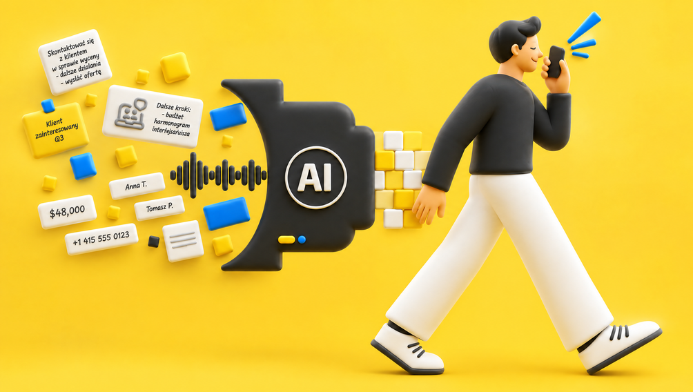
AI in field sales: how an AI assistant is reshaping the Rep's job and company results in 2026
Discover how an AI sales assistant automates reporting, optimizes routes, and boosts sales efficiency. Stop spending evenings updating your CRM.
10 min
Read more
How to Make Your Design System AI-Ready in 2026
Imagine hiring a brilliant, lightning-fast junior designer. They can produce a hundred mockups in an hour, but if you don't give them a crystal-clear brie…
9 min
Read more
Automation in Logistics and Manufacturing: Stop Firefighting! An Incremental Strategy for 2026.
Learn how to implement automation in logistics and manufacturing in 2026. Discover the “small steps” strategy, the costs, and the benefits for your business.
10 min
Read more