



Optimizing the performance of animation rendering on a page
Some animation techniques can tax the system more than others. For example, CSS properties such as margins, padding, positions (e.g. top, left) affect the size and position of elements, causing the browser to have to recalculate the page layout and repaint the elements in each animation frame. In contrast, other properties, such as opacity, transform and filter, do not require layout recalculation or repainting, making their animation less resource-intensive.
See it in the given example:
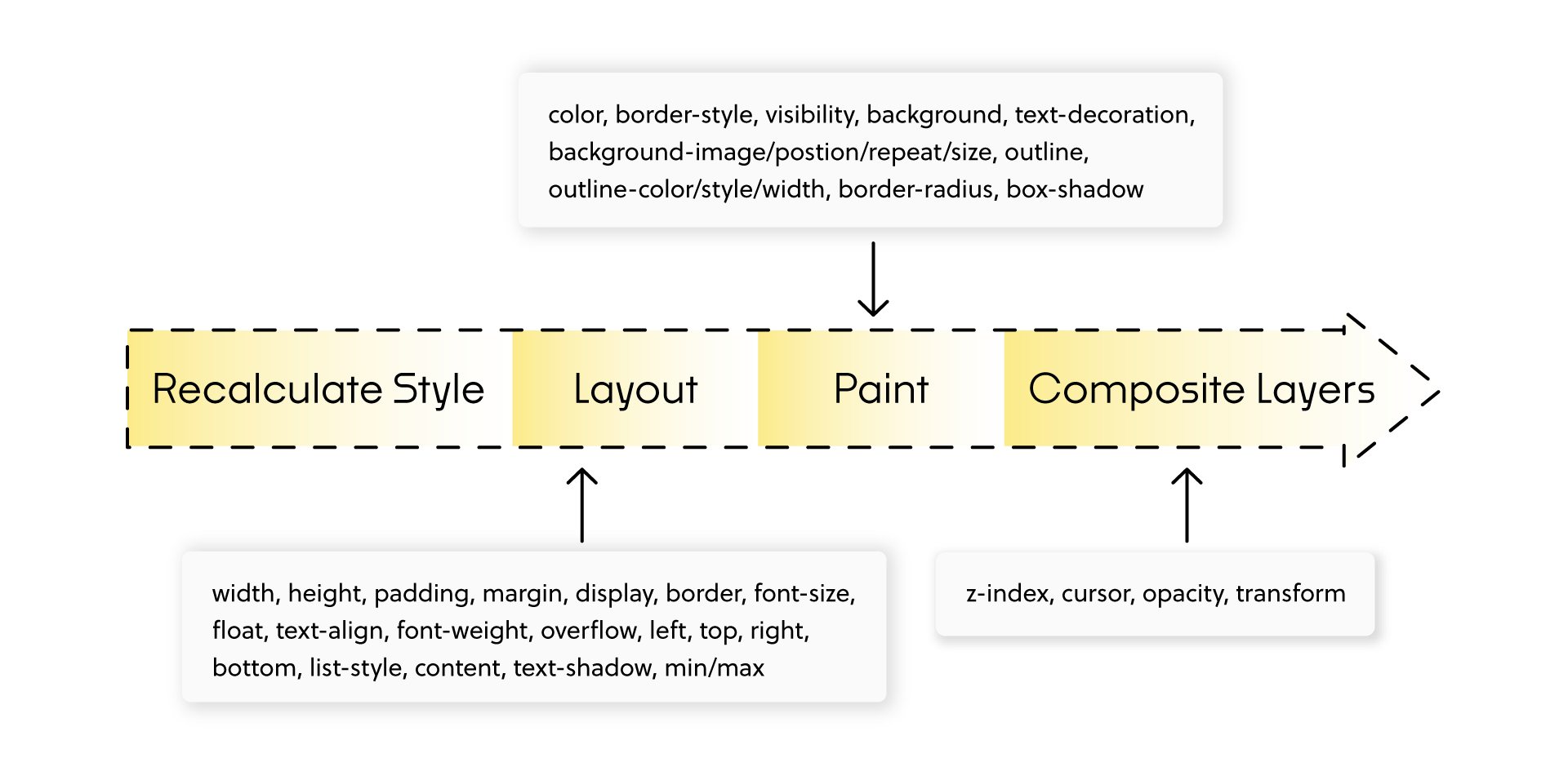
Before the browser displays the final page, there are several steps in the rendering process. In the example above, we can see that: - width, height, padding... cause all the steps to be recalculated - color, border-style, visibility... do not cause the layout to be recalculated - z-index, transform, opacity... do not cause either the layout or the painting to be recalculated
Localizing the problem
The first step was to use the “Paint” highlighting option in Chrome's developer tools.

After investigating the suspicious animations, we discovered something interesting. Our expectation was that the animation would only affect a specific area, and for some reason it was causing unnecessary “repaint” of other elements. It took us literally a few minutes to find other elements on our site exhibiting similar behavior, e.g.:The page header was designed in two versions: full and minimalist. The full version is displayed when the user first enters the site and when scrolling up the page. In other situations, when the user browses the content or scrolls down the page, the minimalist version is displayed. The transition animation between these versions has the effect of advancing additional header elements from the top, which adds fluidity and dynamism to the browsing experience.
This animation was originally implemented as follows:
    transition: all .3s ease;
// pozycja headera w wersji minimalistycznej
margin-top: -4.5rem;
// pozycja headera w wersji pełnej
margin-top: 0;
What is wrong?
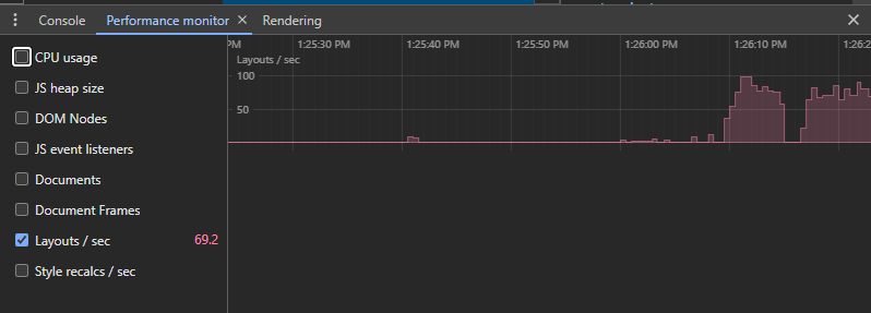
Implemented in this way, the animation is not optimal and has several significant drawbacks. The browser does unnecessary work, refreshing content that it should not. First, changing the spacing affects the layout of the entire component. After recalculating the layout, the browser has to refresh the parts of the page (repaint) that were affected by the margin change, if the margin change affects multiple components. Secondly, the use of transition: all is inefficient, because it causes the animation of all possible CSS properties of the component, even those that are not needed.Below we can see how many style recalculations per second there were and which elements were recalculated/refreshed using the original way. On average we had from 80 refreshes per second.

Header animation optimization
Our goal was to avoid layout recalculation and element refresh steps as much as possible. You can read more about optimizing the page rendering here.
We started optimizing this step by step. We restricted the transition property to animate only the transform property, instead of using the generic all notation. Instead of animating the margin, we used the transform property (translate3d). Transforms are usually handled by the GPU, which improves the performance of painting and re-painting.Why, by using the transform property, we let the browser skip the layout recalculation and refresh steps. The browser simply moves the already painted layers, which is called composition. Rewritten version:
    transition: transform .3s ease;
// pozycja headera w wersji minimalistycznej
transform: translate3d(0, 0, 0);
// pozycja headera w wersji pełnej
transform: translate3d(0, -4.5rem, 0);

Promoting elements
The animated component must be on its own composition layer. If this is not the case, then to achieve this, you can try to use the will-change property that will promote our element. will-change: transform; This informs the browser that we anticipate a change in the transform property of the component, thereby increasing the likelihood that the element will be moved to a separate composition layer. Warning: Don't promote components unnecessarily.
Avoid excessive use of this rule. Layers require memory and management.
You can read more about the will-change property and managing the number of layers here and here
Results
After applying the new approach, the average number of layout and style conversions per second of page refreshes has decreased to 2-4 times per second. In addition, reflow and repaint are now performed only in those places where they are absolutely necessary.
It is worth noting that the header further contains components that trigger reflow and repaint. In our case, several icons had the opacity property set, so that changing the transition in the parent component forced the repaint of these icons.


Let's talk about potential areas of collaboration!
Hi!
during the first consultation we'll analyze your goals through the lens of ROI and operational risk. Whether we're building an Enterprise system, an application, or an AI automation — together we'll plan an architecture that eliminates your technical debt and unlocks scalability.


You can find more articles on this topic on our blog

Tailwind CSS: Ending "CSS Hell" – How Utility-First Architecture Lowers TCO and Stabilizes Scalable Projects
Discover Tailwind CSS – the "utility-first" framework revolutionizing the frontend. See how it cuts development time and guarantees design consistency in web design.
6 min
Read more

Developer Experience is your shop’s hidden ROI: Why does a happy developer earn you more?
See how a developer’s work impacts your store’s ROI. Find out why modern software and a high Developer Experience are the key to rapid implementation and profits.
6 min
Read more
Craft over Trends: Why Fundamentals are the Heart of Modern Web Development in 2026
In 2026, technology is all about craftsmanship. Discover the fundamentals, best practices, and modern web development trends that stay ahead of AI.
5 min
Read more